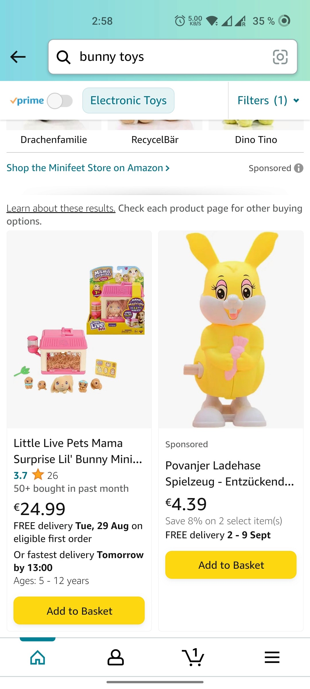
2 Consistency and Standards
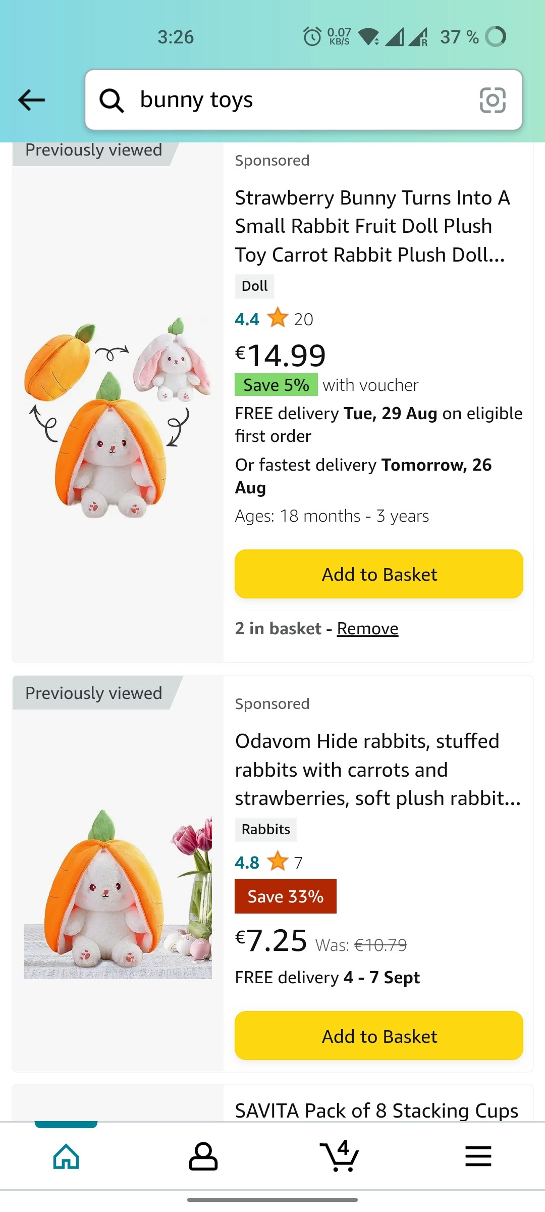
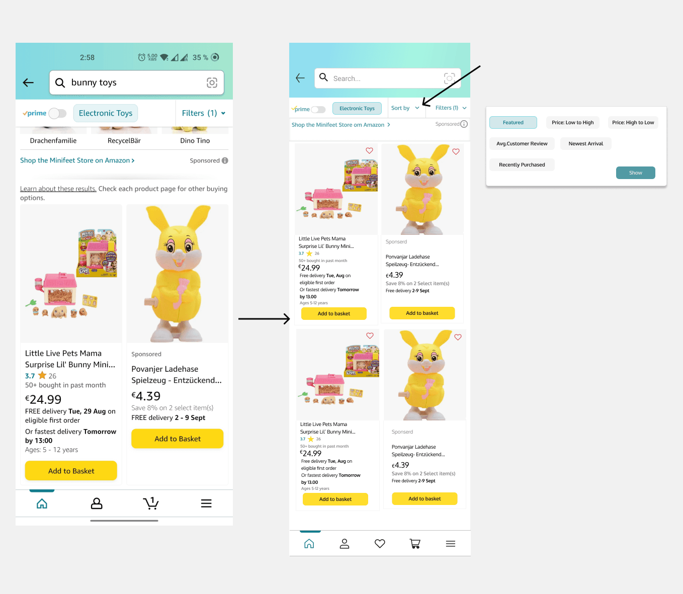
In the Amazon App so many places there they don’t have a consistency. For example I found Buttons are not placed well and the item view in some pages its appear one by one and other places it appear as cards. Here I decided to change those Places.
2 Consistency and Standards
In the Amazon App so many places there they don’t have a consistency. For example I found Buttons are not placed well and the item view in some pages its appear one by one and other places it appear as cards. Here I decided to change those Places.
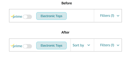
4 Flexibility and Efficiency
For flexibility I figured it the filter option was a really big list. If user wants to sort their searched product it is very long process so I decided to Separate the sort option on the top and near to the filter.
so user can sort their product at any time. There is a one more option is recently purchased product option I have added because Every one wants the good review and new product as people purchased.
4 Flexibility and Efficiency
For flexibility I figured it the filter option was a really big list. If user wants to sort their searched product it is very long process so I decided to Separate the sort option on the top and near to the filter.
so user can sort their product at any time. There is a one more option is recently purchased product option I have added because Every one wants the good review and new product as people purchased.
Visibility of System Changes
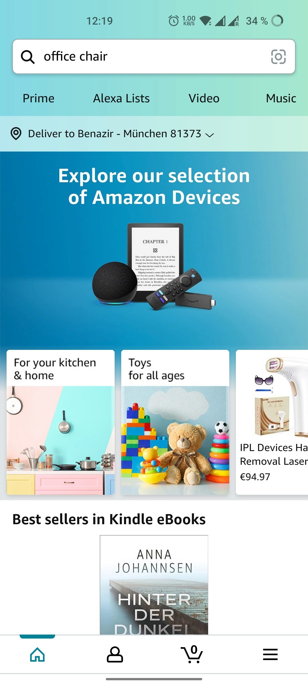
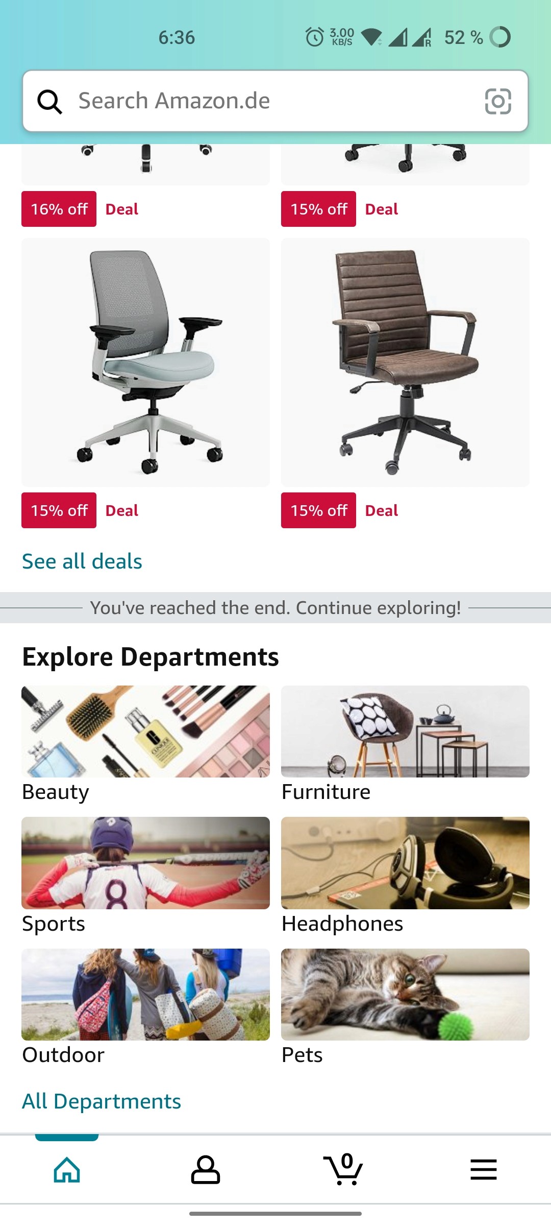
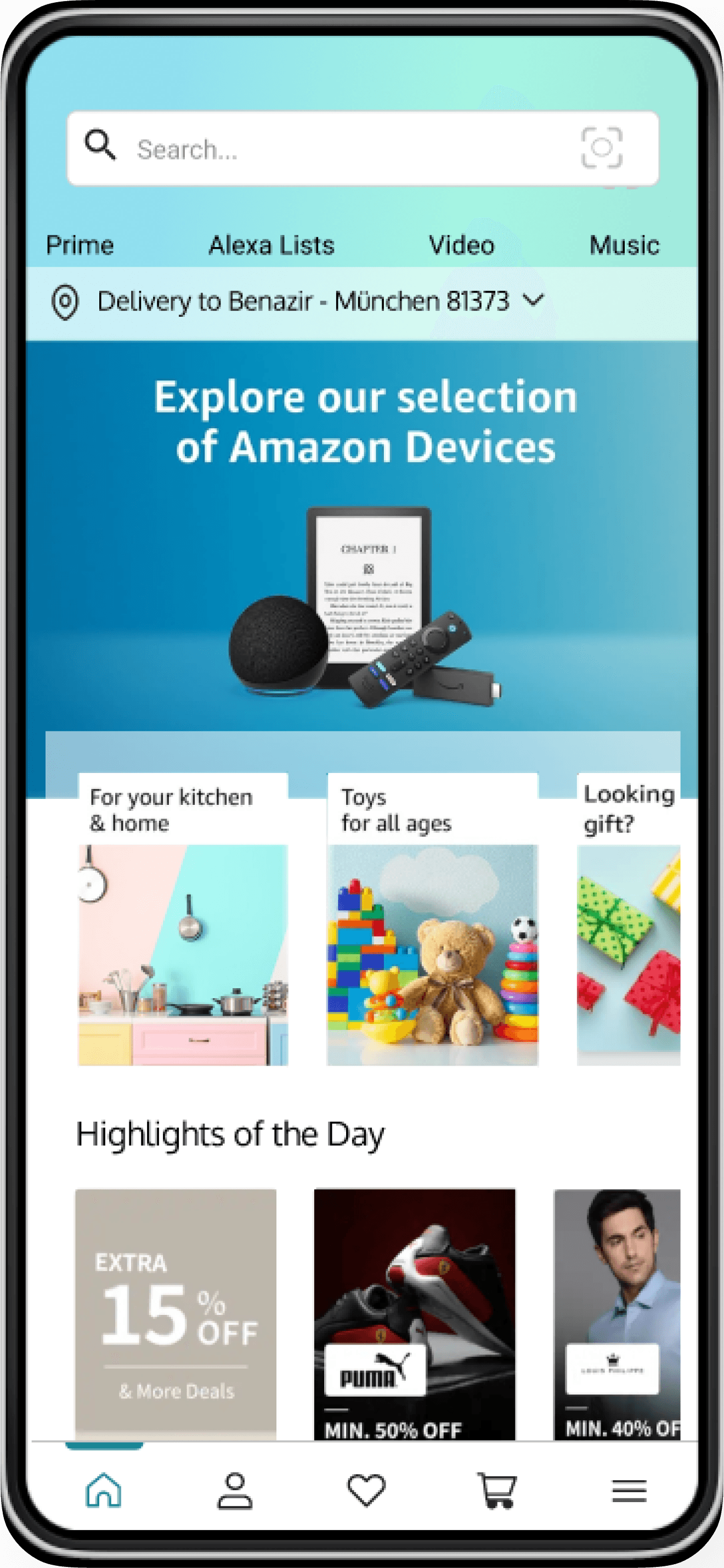
For the Visibility Its comes to the Home Page. “First Impression is the Best Impression”. We all know about this quote. This is what Hit my mind when i open the Amazon app. As a user whenever I open the app its always been a repeated content like I already purchase content.
Sometime its look niche and I don’t want to browse a home page. Here I thought If the Interesting content Like Top deals and Highlights of the day should be more Helpful and Easy to browse.
Visibility of System Changes
For the Visibility Its comes to the Home Page. “First Impression is the Best Impression”. We all know about this quote. This is what Hit my mind when i open the Amazon app. As a user whenever I open the app its always been a repeated content like I already purchase content.
Sometime its look niche and I don’t want to browse a home page. Here I thought If the Interesting content Like Top deals and Highlights of the day should be more Helpful and Easy to browse.
Heuristic Analysis
3 Recognition rather than recall
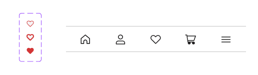
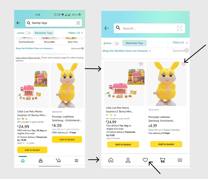
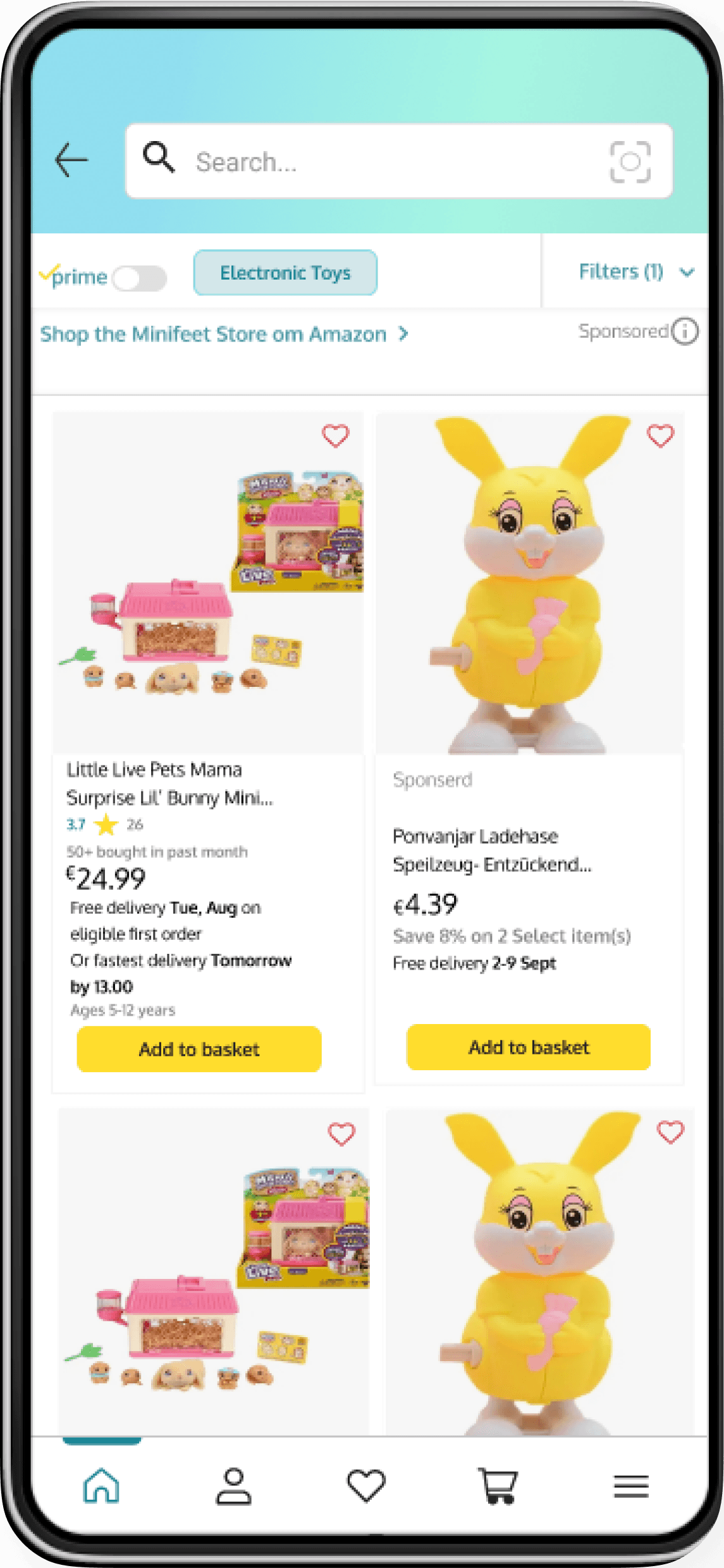
In Amazon they have a Wishlist list. But where it is navigated it is bit difficult to find in the app. As a user for me it took some time to find my Wishlist. I decided to put the heart icon on the items top right and the selected Wishlist should be highlighted. It will recalls us that we have selected as a Wishlist.
3 Recognition rather than recall
In Amazon they have a Wishlist list. But where it is navigated it is bit difficult to find in the app. As a user for me it took some time to find my Wishlist. I decided to put the heart icon on the items top right and the selected Wishlist should be highlighted. It will recalls us that we have selected as a Wishlist.
5.Help users recognize, diagnose and recover from errors
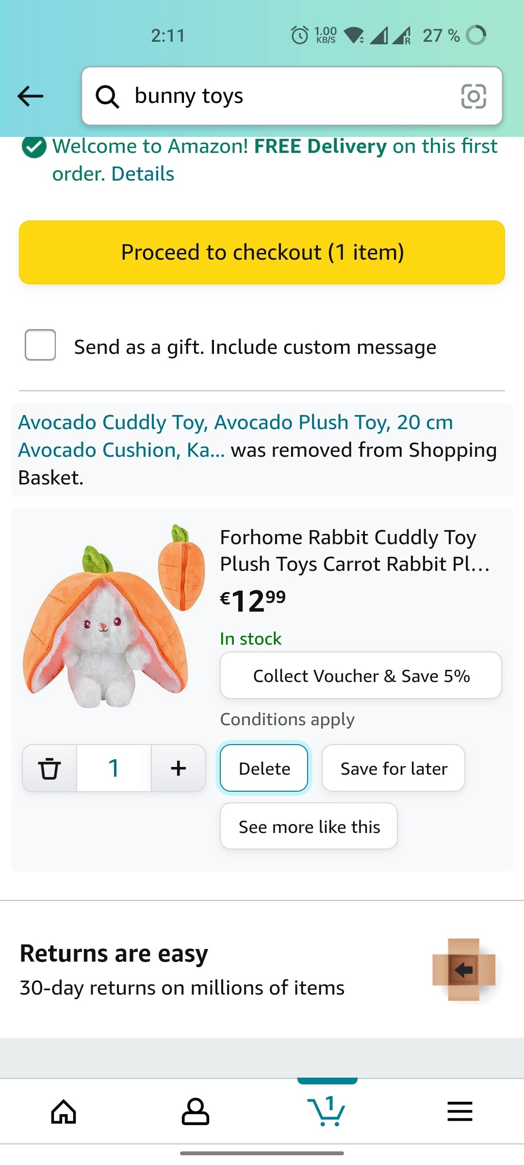
When comes to the recovery. Amazon does not have the recovery option to the deleted items. As a user if I accidently deleted the items its couldn't be recoverable. It is the most important part to the app. So I decided to put the list of deleted items in cart.
5.Help users recognize, diagnose and recover from errors
When comes to the recovery. Amazon does not have the recovery option to the deleted items. As a user if I accidently deleted the items its couldn't be recoverable. It is the most important part to the app. So I decided to put the list of deleted items in cart.
Components
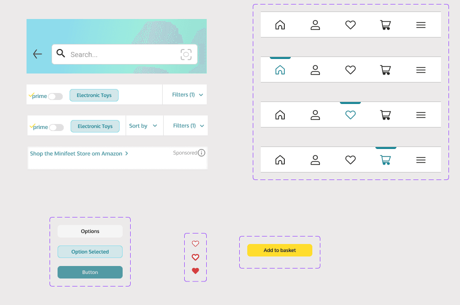
Here I created the components that will be used most of the screens. It is really very helpful to building an app because first I pre build the parts of my app and place it together.
Components
Here I created the components that will be used most of the screens. It is really very helpful to building an app because first I pre build the parts of my app and place it together.
Hi-fi
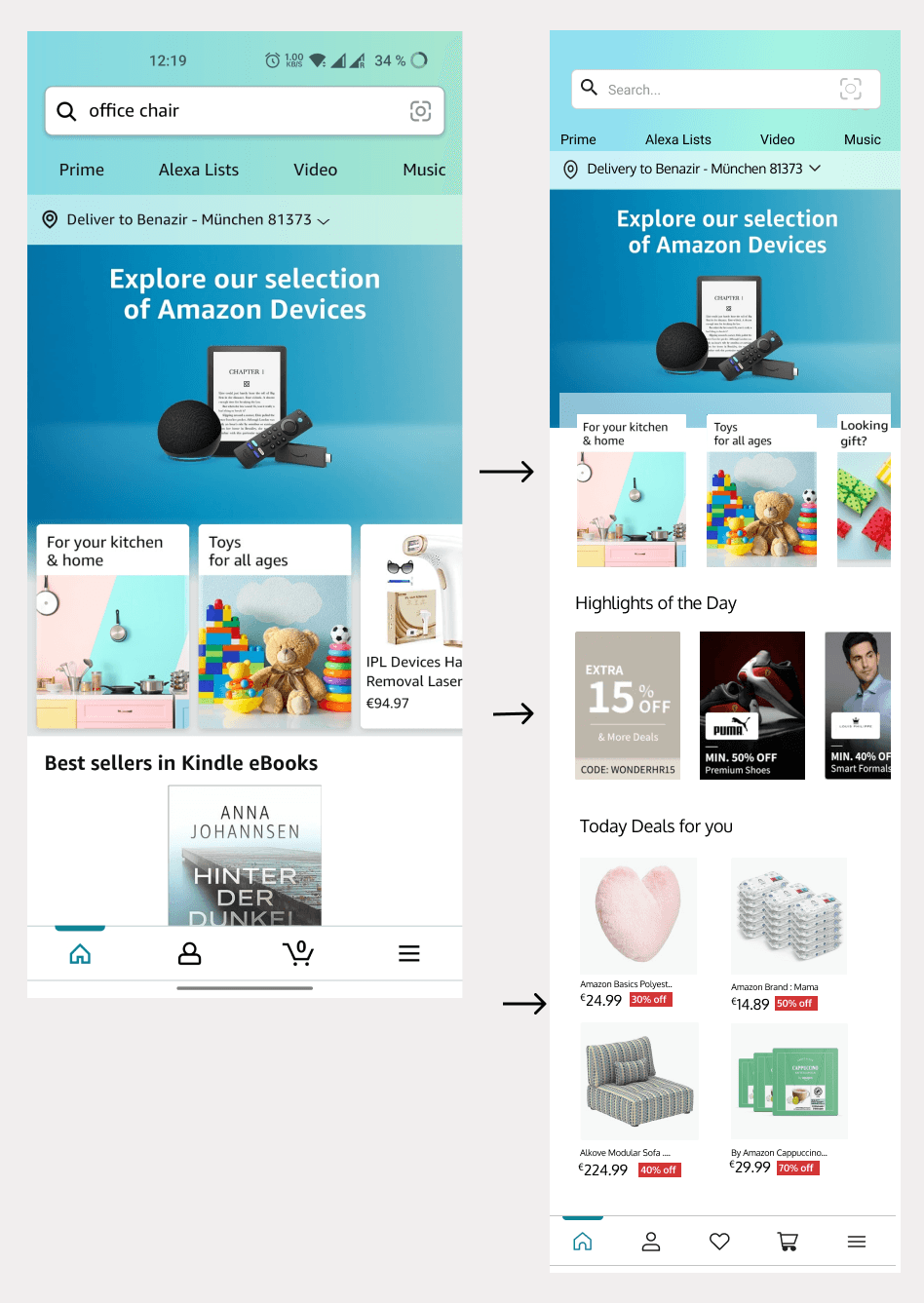
Having a clear visual identity for the brand, we immediately focused on completing the designs for my screens. In My Hi-fi, I began with the Home Page. Initially, I positioned the components on the main page based on the analysis, placing the daily highlights and deals to attract users to click on the page. This could serve as my marketing strategy for placement on the Home Page.
Having a clear visual identity for the brand, we immediately focused on completing the designs for my screens. In My Hi-fi, I began with the Home Page. Initially, I positioned the components on the main page based on the analysis, placing the daily highlights and deals to attract users to click on the page. This could serve as my marketing strategy for placement on the Home Page.
Style Tile
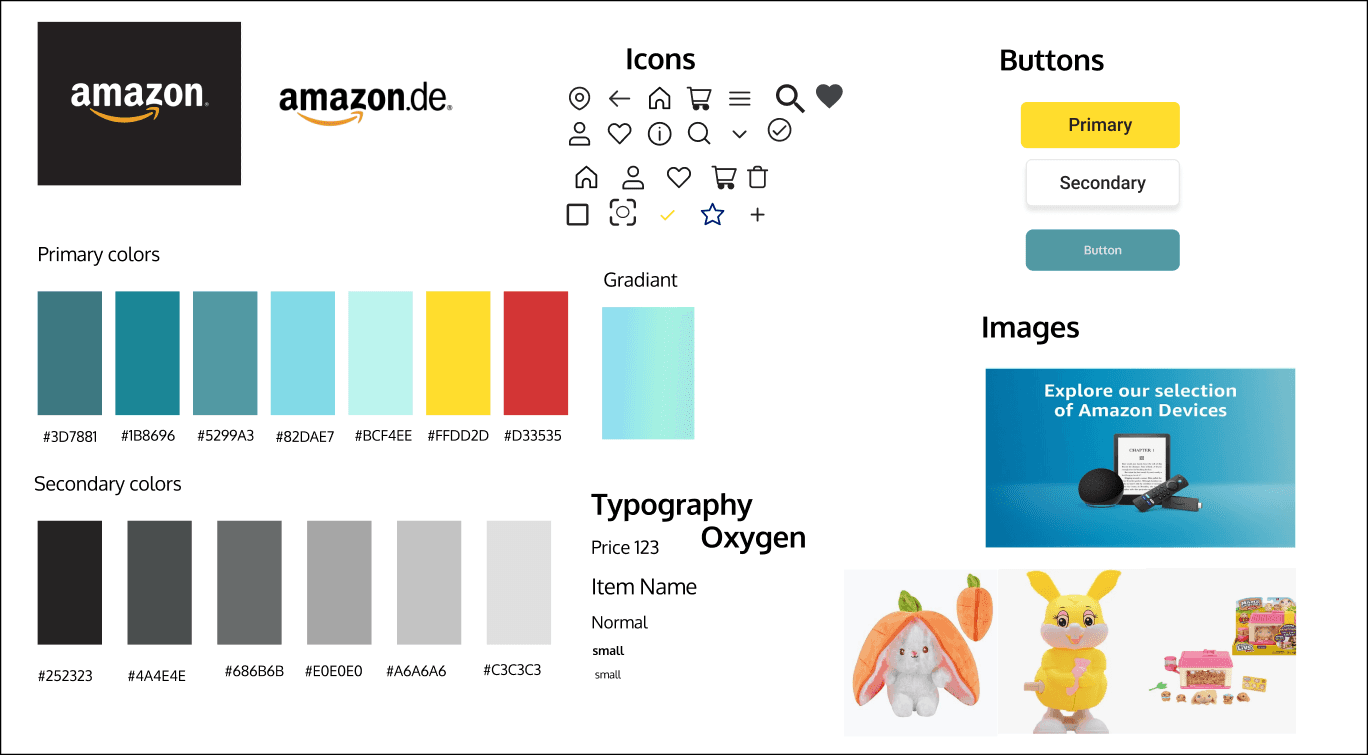
When comes to the UI Part first we need the styles. First thing is logo. I downloaded from online and collected the icons, primary, secondary colors. Images I place the images and buttons have been used on my hi-fi.
Style Tile
When comes to the UI Part first we need the styles. First thing is logo. I downloaded from online and collected the icons, primary, secondary colors. Images I place the images and buttons have been used on my hi-fi.
6.Help and Documentation
As I told before the wish list. I decided to place the heart icon in the middle of the navbar. It will help to the user can easily go the the list and easy recognitional to the user.
6.Help and Documentation
As I told before the wish list. I decided to place the heart icon in the middle of the navbar. It will help to the user can easily go the the list and easy recognitional to the user.
Concept Sketch
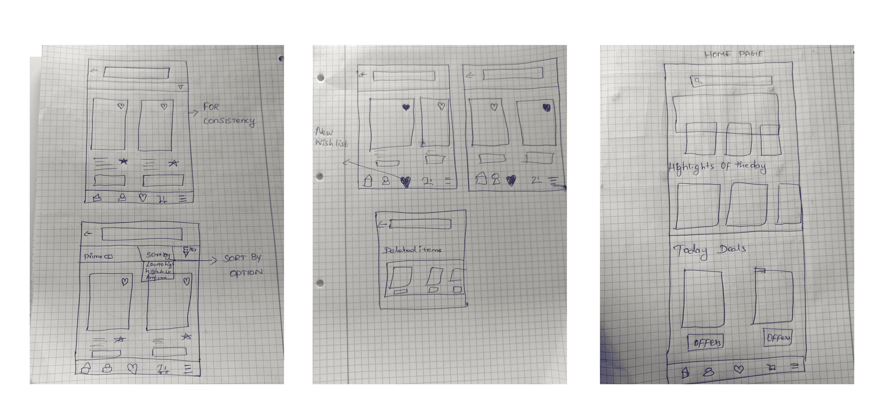
The next step after analyzing the problem I found and started sketching on the paper. Here I added my low-fi.
Concept Sketch
The next step after analyzing the problem I found and started sketching on the paper. Here I added my low-fi.
In My Hi-fi I started with the Home Page. First I Placed the components to the main page from the analysis.Here you see the sort option near to the filter. After Clicking to the sort option the option will be appear so user can easily sort their options.
In My Hi-fi I started with the Home Page. First I Placed the components to the main page from the analysis.Here you see the sort option near to the filter. After Clicking to the sort option the option will be appear so user can easily sort their options.
Conclusion
My Learning from Ironhack journey are mainly tied to the respectable opportunity to learn from each other and be appreciative about the knowledge and development individually. Opening up about our unique work styles in the beginning definitely set a precedent regarding the next steps over the bridge named user experience design.
As a key learnings, I have learned a lot through the tests. I have learned the lots in Figma from my mistakes I did in alignments, learning by listening to the users and making the most correct decision has been the most rewarding part of the project.
Conclusion
My Learning from Ironhack journey are mainly tied to the respectable opportunity to learn from each other and be appreciative about the knowledge and development individually. Opening up about our unique work styles in the beginning definitely set a precedent regarding the next steps over the bridge named user experience design.
As a key learnings, I have learned a lot through the tests. I have learned the lots in Figma from my mistakes I did in alignments, learning by listening to the users and making the most correct decision has been the most rewarding part of the project.
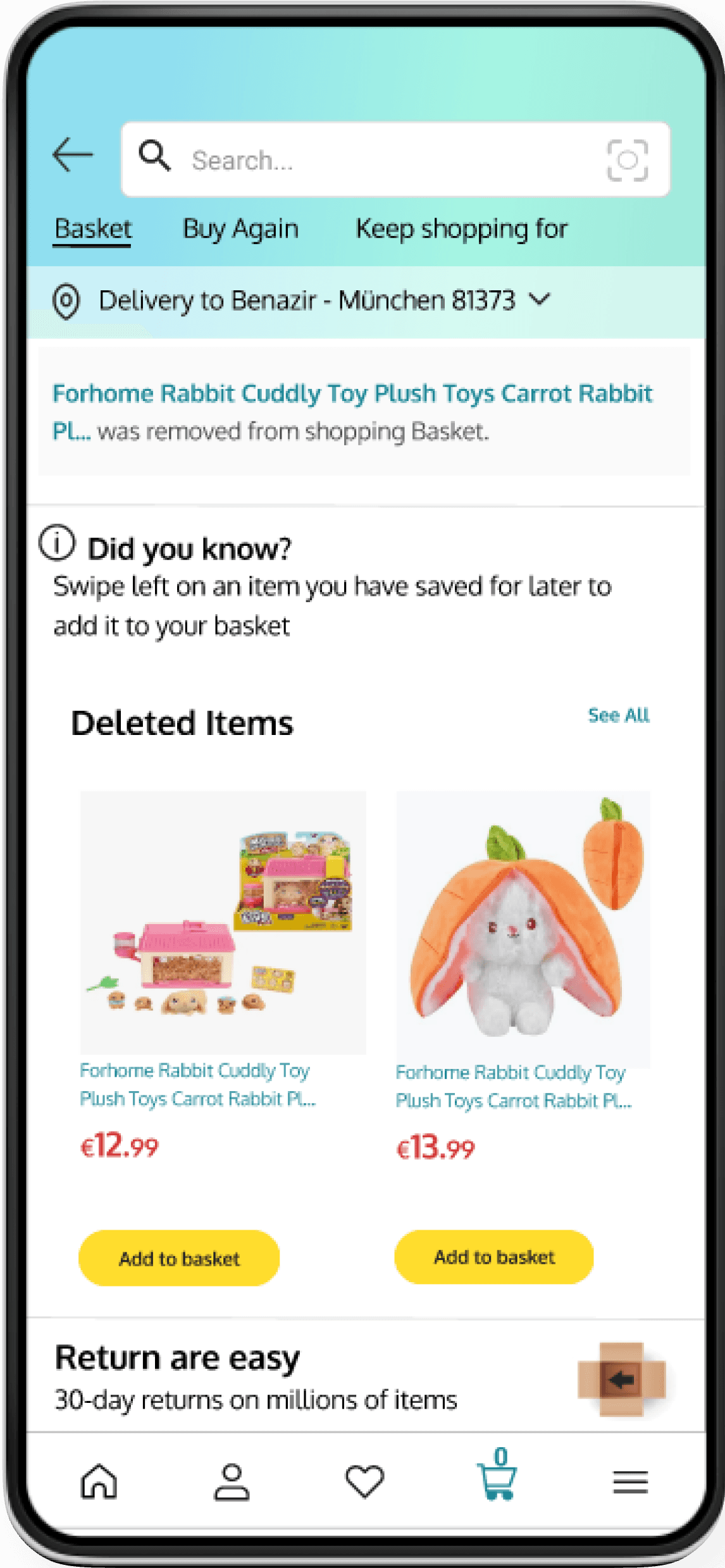
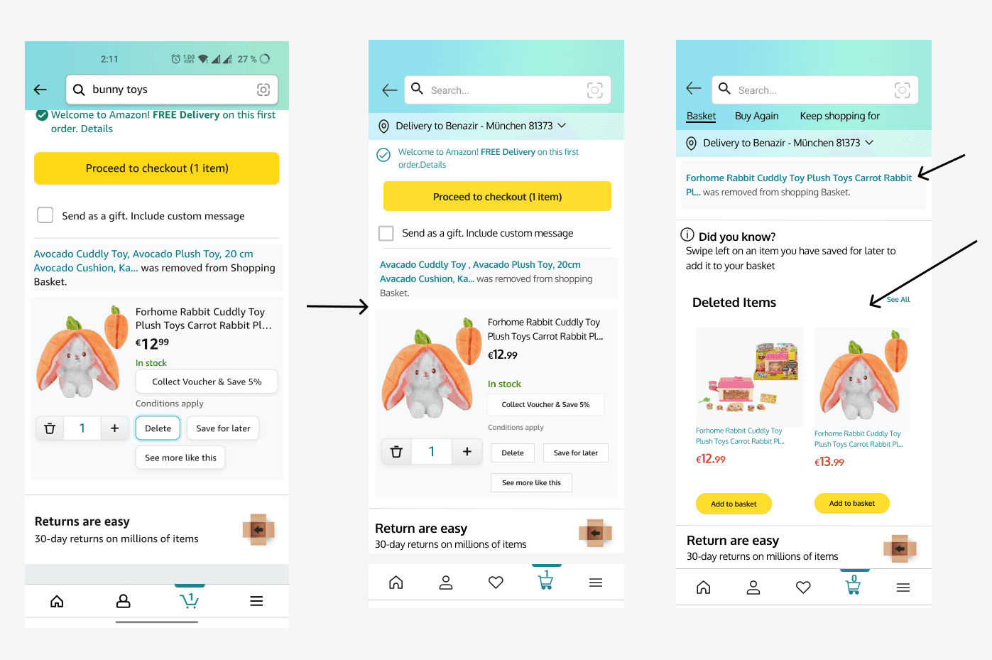
Subsequently, the most vital recovery decision. After the objects' elimination, I situated the cleared items on the Basket page. Users can scroll right or tap the View All choice to exhibit the list of removed articles.
Subsequently, the most vital recovery decision. After the objects' elimination, I situated the cleared items on the Basket page. Users can scroll right or tap the View All choice to exhibit the list of removed articles.
Challenge
All are acquainted with the Amazon App. I've observed numerous alterations. As a user, I incorporate my personal experiences, offering suggestions to enhance the app's adaptability.
Project Overview
This is my personal endeavor at the Ironhack Bootcamp. I was tasked with redesigning an app using 10 heuristic analysis methods to greatly improve the current version. For this project, I selected the Amazon.de Mobile App.
Details
Roles: UX/UI Designer
Duration: 4 days
Methods: User research,Heuristic analysis, Styletile, Wireframes, Low fidelity prototyping, High Fidelity prototyping.