App for Navigating Within the Hospital Environment

A Wicked Problem

Care-Nav

App for Navigating Within the Hospital Environment

A Wicked Problem

Care-Nav

Challenge

Hello! This is my first Project in IronHack UX/UI Bootcamp. We Assigned to create a wicked problem to public hospitals. Our team discussed about the topic and finally we decided to create a mobile app

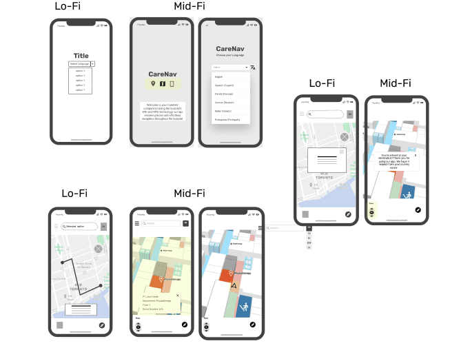
Low-fidelity prototype

Mid-fidelity prototype

Project Overview

In this case study, I will explain the design process for a Wicked problem in a public hospitals. for the people who have lost inside the hospital and they could’nt find the destination. We planned to create a Navigation app that helps to find the place.

Details

Roles: UX/UI Designer

Duration: 8 days

Methods: User research: quantitative and qualitative research, Affinity mapping, Moscow Method, Moodboard, Wireframes, Low fidelity prototyping,User testing.
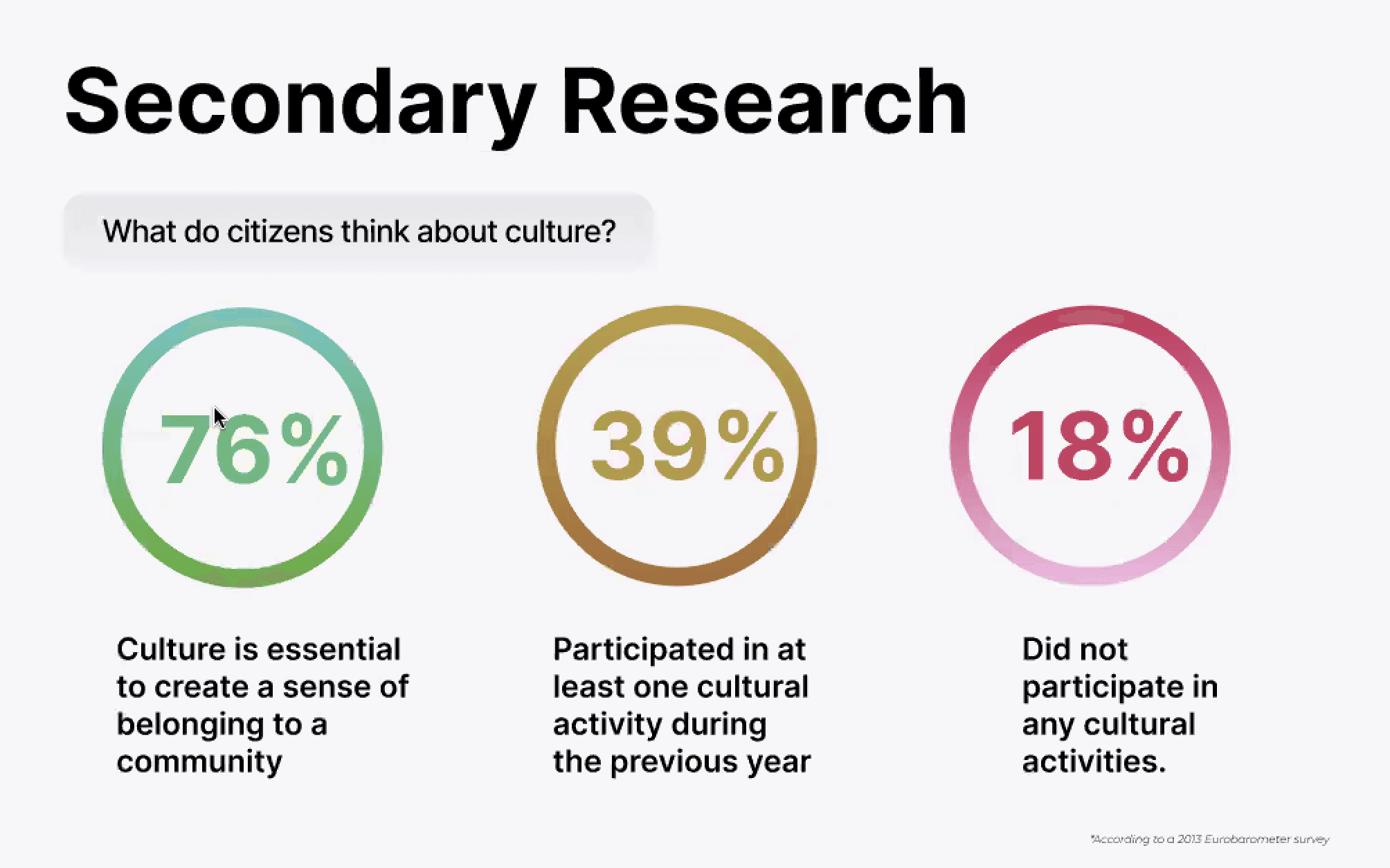
Research and competitive analysis


We started with group brainstorming, thinking of all possible pain points that a person who is visiting a hospital could have. With that, we attempted individually to do secondary research on the topic. The difficulties people face in the hospitals are:


Booking & Review: Users prioritize quick and reliable methods to identify and select healthcare professionals. They particularly value the availability of positive reviews to assist in their decision-making process. The application of Natural Language Processing (NLP) technology could be utilized to automatically classify these reviews, making the selection of the right doctor an even more straightforward process for patients.


Research and competitive analysis


We started with group brainstorming, thinking of all possible pain points that a person who is visiting a hospital could have. With that, we attempted individually to do secondary research on the topic. The difficulties people face in the hospitals are:


Booking & Review: Users prioritize quick and reliable methods to identify and select healthcare professionals. They particularly value the availability of positive reviews to assist in their decision-making process. The application of Natural Language Processing (NLP) technology could be utilized to automatically classify these reviews, making the selection of the right doctor an even more straightforward process for patients.


Empathize

Survey and User Interview


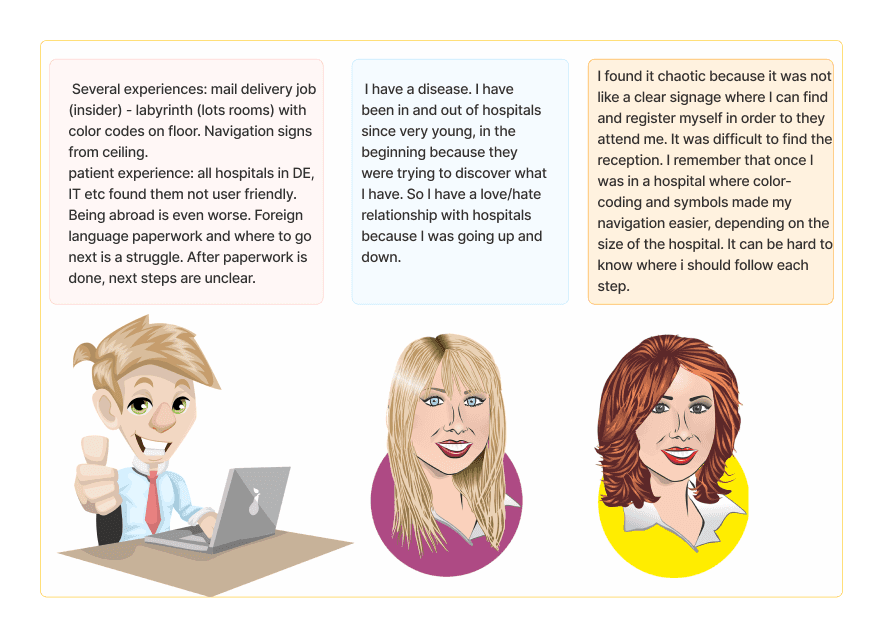
We interviewed people withinother groups in the Bootcamp. They shared their experience on their hospital visits, finding the doctor’s room and the usage of hospital’s navigation system.

Survey and User Interview


We interviewed people withinother groups in the Bootcamp. They shared their experience on their hospital visits, finding the doctor’s room and the usage of hospital’s navigation system.


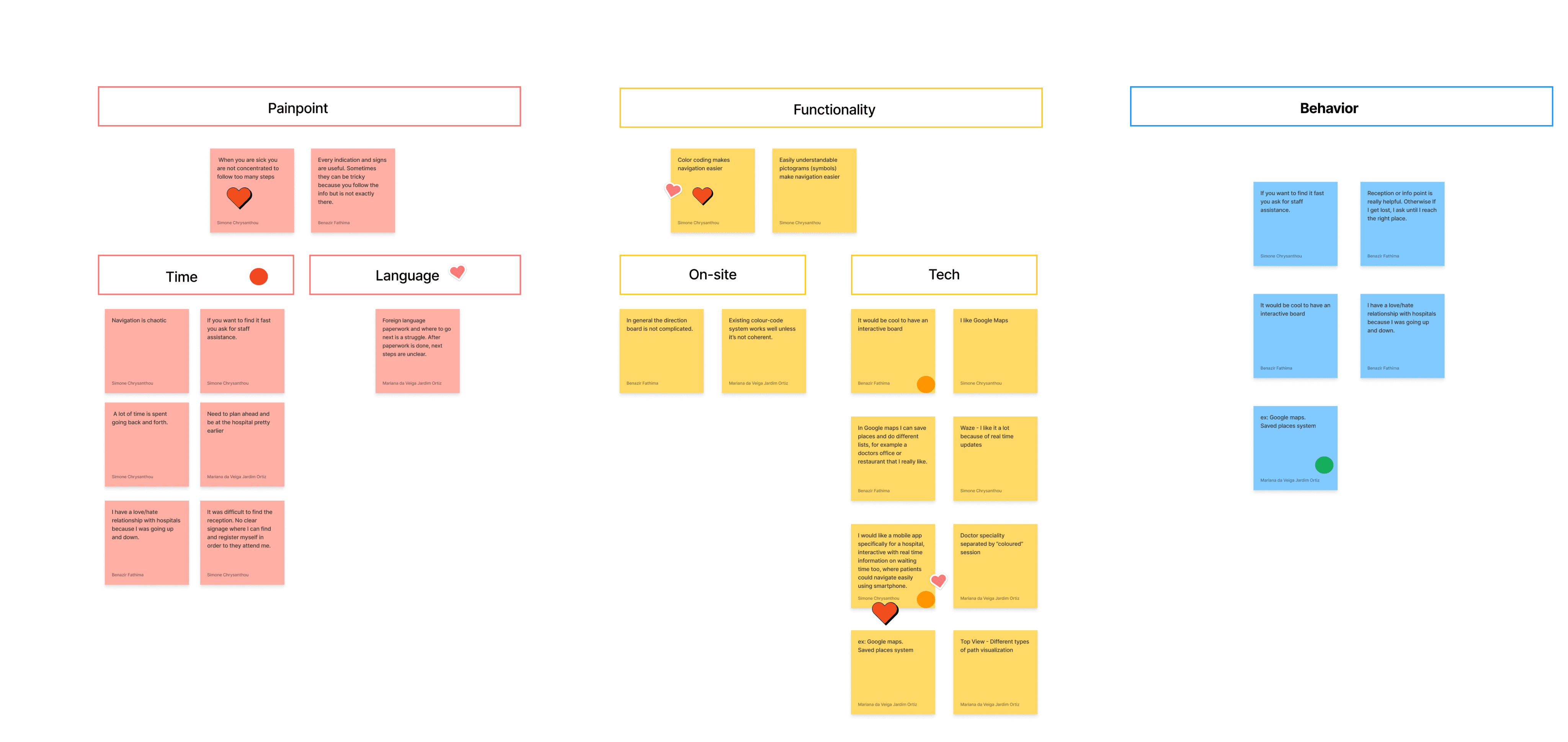
After the interview, all our notes were transferred to post it in Figjam in order to create an Affinity Diagram. We realized we might have interpreted the process in different ways, so we decided to proceed with solo approach first, each clustering post-its in their own way. After that, we had a discussion on how each of us did it. Reflecting on it shows that some approaches were logical logical, and some were more emotional. After Further discussing, we reached a place that incorporated both approaches, with categories that are not too broad but still practical, which in turn set us up to think about what features we wanted to try and design.

We categorized our affinity diagram into

Pain Points

Functionality

behavior


After the interview, all our notes were transferred to post it in Figjam in order to create an Affinity Diagram. We realized we might have interpreted the process in different ways, so we decided to proceed with solo approach first, each clustering post-its in their own way. After that, we had a discussion on how each of us did it. Reflecting on it shows that some approaches were logical logical, and some were more emotional. After Further discussing, we reached a place that incorporated both approaches, with categories that are not too broad but still practical, which in turn set us up to think about what features we wanted to try and design.

We categorized our affinity diagram into

Pain Points

Functionality

behavior

Affinity Diagram

Define

She gets frustrated by the complicated hospital layouts, time spent asking for directions and going back and forth as she navigates different departments for different needs. Since her relatives need to see various specialists, she isn't familiar with the directions to each of them.

Frustrations

Navigate easily using her smartphone

Get to the appointment on time

Navigate the hospital without the need to communicate in a foreign language

Goals

Sarah is a 35-year-old expat from England who recently moved to a new country due to a job opportunity. She suffers from chronic neck pain and carpal-tunnel syndrome. Because of this she needs to regularly visit the hospital for her treatment but she also needs to accompany her relatives when they have to visit the hospital.


Biography

I would like to be on time for my appointments at the hospital

Devices:

Location: Big City

Occupation: Office Manager

Age: 35

Sarah
User Persona


After the interviews we created one user persona. Her name is Sarah.

User Persona


After the interviews we created one user persona. Her name is Sarah.

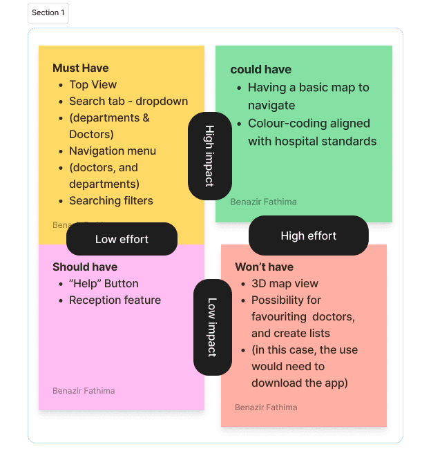
Moscow Method


Then we moved on to ideation. We started with the ‘Crazy 8’ and ended up with lots of ideas. Some were professional and others impractical.Some of which turned into our feature ideas. Ideation is of two types.


We chose the Impact matrix method. We derived the issues and split them into different impact effects.

Moscow Method


Then we moved on to ideation. We started with the ‘Crazy 8’ and ended up with lots of ideas. Some were professional and others impractical.Some of which turned into our feature ideas. Ideation is of two types.


We chose the Impact matrix method. We derived the issues and split them into different impact effects.

Ideate

Information Architecture:Sitemap


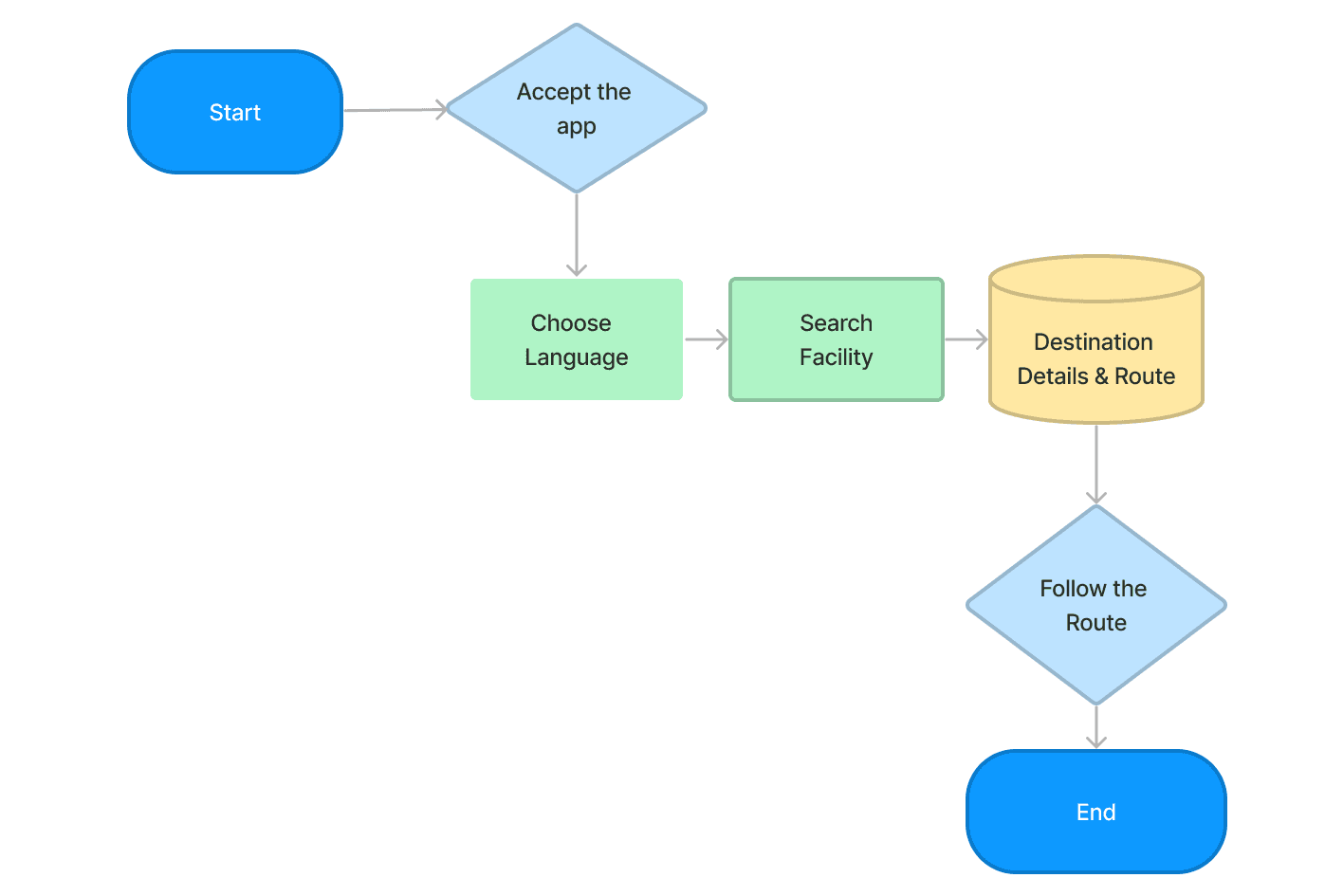
User flow includes all processes from opening the app until closing it. We drew our userflows individually and combined it together to make a perfect navigation process user-flow diagram. Our app’s user flow is

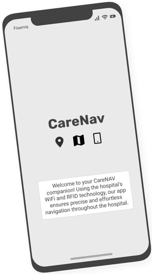
Start and accept the app

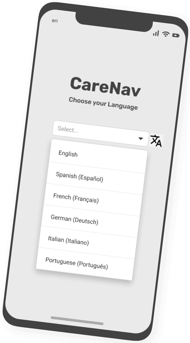
language selection

Search the facility or destination where she wants to go

Showing direction details and route

Reaching the destination

Information Architecture:Sitemap


User flow includes all processes from opening the app until closing it. We drew our userflows individually and combined it together to make a perfect navigation process user-flow diagram. Our app’s user flow is

Start and accept the app

language selection

Search the facility or destination where she wants to go

Showing direction details and route

Reaching the destination

Concept Sketch


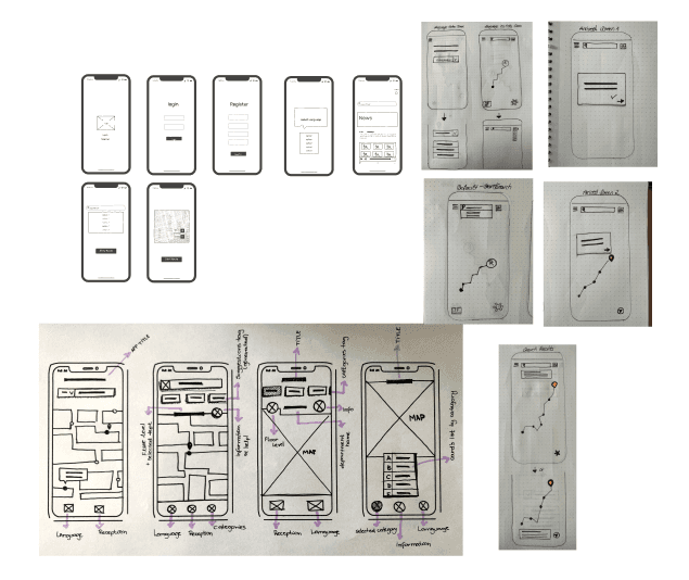
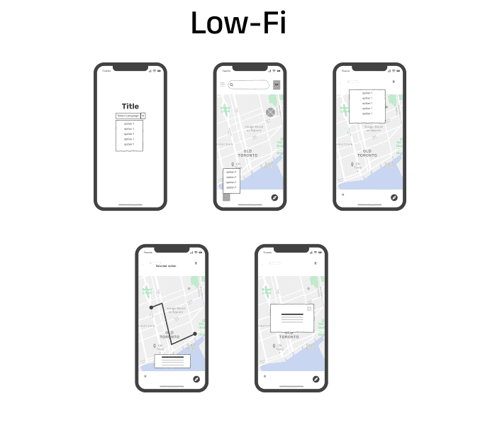
Next would be Lo-fi wire frames. Essential things needed for low-fi wire framing are content and layout. It is like a basement to the app. It allows us to visualize our ideas and explore wide range of ideas.

I used the templates in digital drawing in figma which made it easier and saved time as well.

Concept Sketch


Next would be Lo-fi wire frames. Essential things needed for low-fi wire framing are content and layout. It is like a basement to the app. It allows us to visualize our ideas and explore wide range of ideas.

I used the templates in digital drawing in figma which made it easier and saved time as well.

Usability Testing

Prefers our app’s simplicity over Google Maps.

Doesn’t press “start” on Google Maps due to phone crashes; only follows the route visually.

Finds terms clear and the interface clutter-free.

Users want to test everything they see on screen.

Glances at the steps without strictly following them but appreciated option to see them and close them.

Prefers our app’s simplicity over Google Maps.

Doesn’t press “start” on Google Maps due to phone crashes; only follows the route visually.

Finds terms clear and the interface clutter-free.

Users want to test everything they see on screen.

Glances at the steps without strictly following them but appreciated option to see them and close them.

Mid-fi

Mid-fi is the process between low-fi and hi-fi. It is a realistic copy of an actual app, It contains icons and the more information that an actual app have.

Conclusion


The process and the final result has left me very satisfied. It has been hard work, especially when it comes to taking out the Problem Statement. But I think that the proposed option is the best to solve the frustrations and needs of my user.

As a key learnings, I have learned a lot through the tests. Posing the questionnaire screen a thousand times, learning by listening to the users and making the most correct decision has been the most rewarding part of the project.

Conclusion


The process and the final result has left me very satisfied. It has been hard work, especially when it comes to taking out the Problem Statement. But I think that the proposed option is the best to solve the frustrations and needs of my user.

As a key learnings, I have learned a lot through the tests. Posing the questionnaire screen a thousand times, learning by listening to the users and making the most correct decision has been the most rewarding part of the project.