Challenge
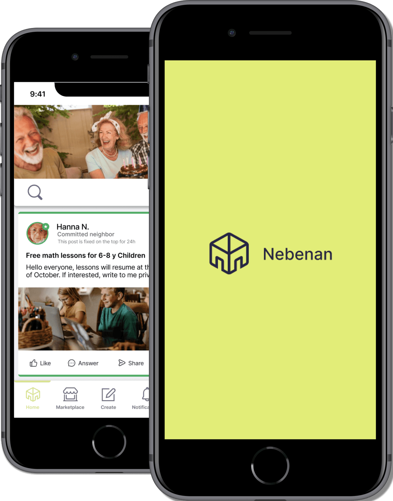
Hello! This is my final Project in IronHack UX/UI Bootcamp with real clients. We Assigned to celebrate the committed neighbor In the nebenan app.Finally we decided to create a mobile version
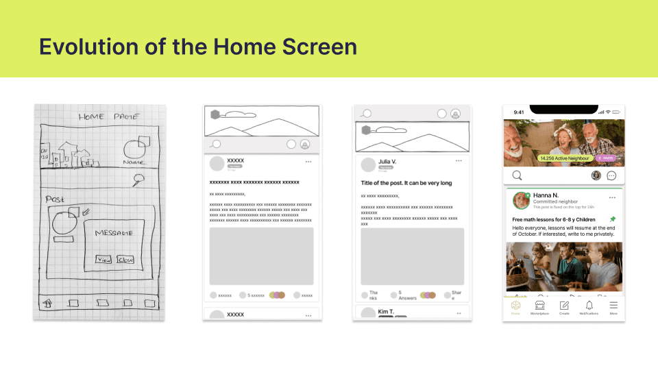
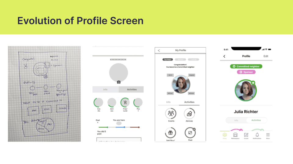
Low-fidelity prototype
Mid-fidelity prototype
Hi-fidelity prototype
Project Overview
In this case study, I will explain the design process for a celebrating a committed neighbor in Nebenan. For the people who have committed neighbor tag, They have star badge.Other users don’t have an idea about the committed neighbor. Our main Goal is to how to recognize and celebrate the committed neighbor people..
Details
Roles: UX/UI Designer
Duration: 10 days
Methods: User research: quantitative and qualitative research,User Interview, Affinity mapping, Moscow Method,Sitemap, Wireframes, Low-fi,Mid-fi,Hi-fi prototyping,User testing.
Empathize
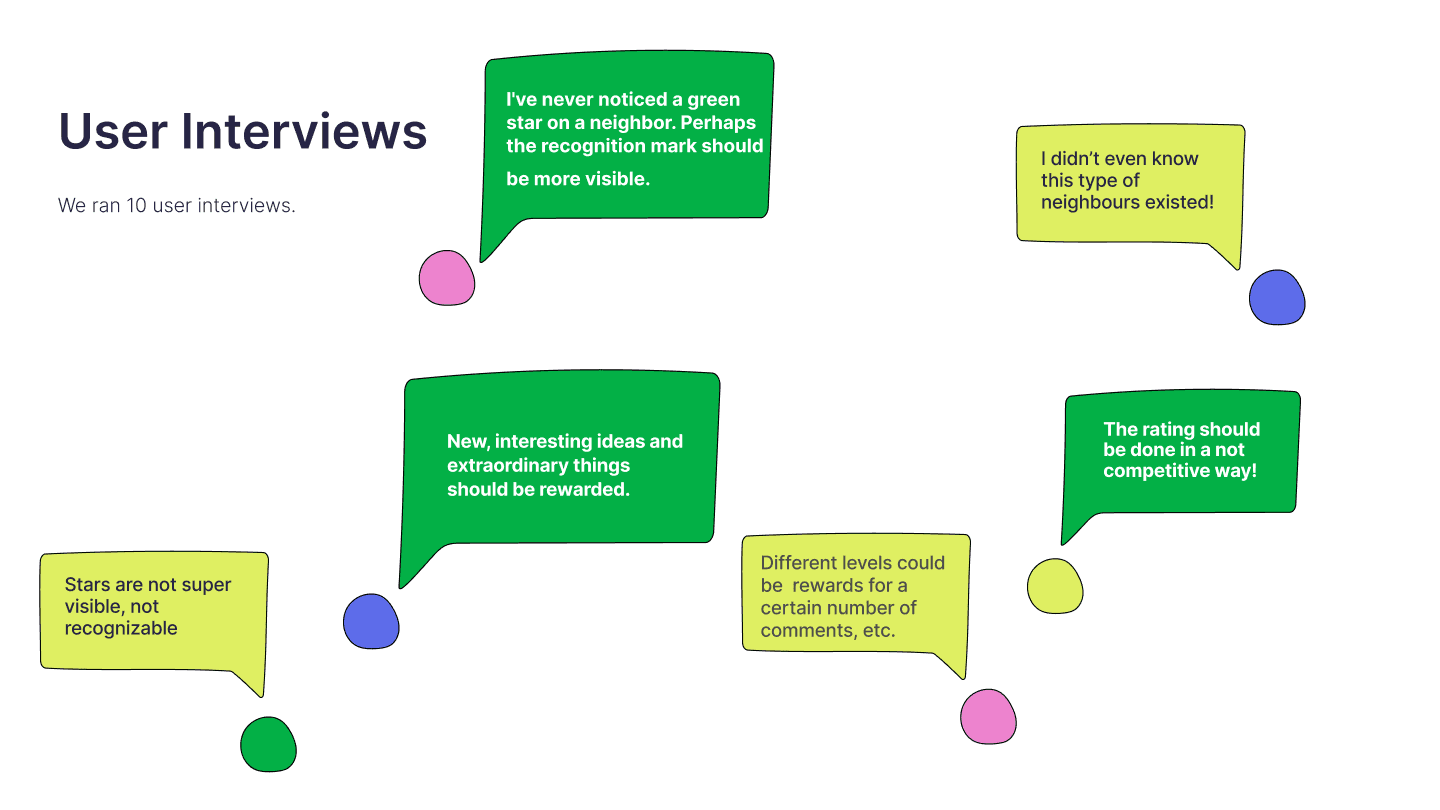
Survey and User Interview
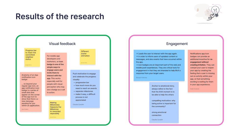
We took a survey on the people who actually using the nebenan app. The survey questions about the committed neighbor. Some of the doesn't know about the committed neighbor and the badge.
Define
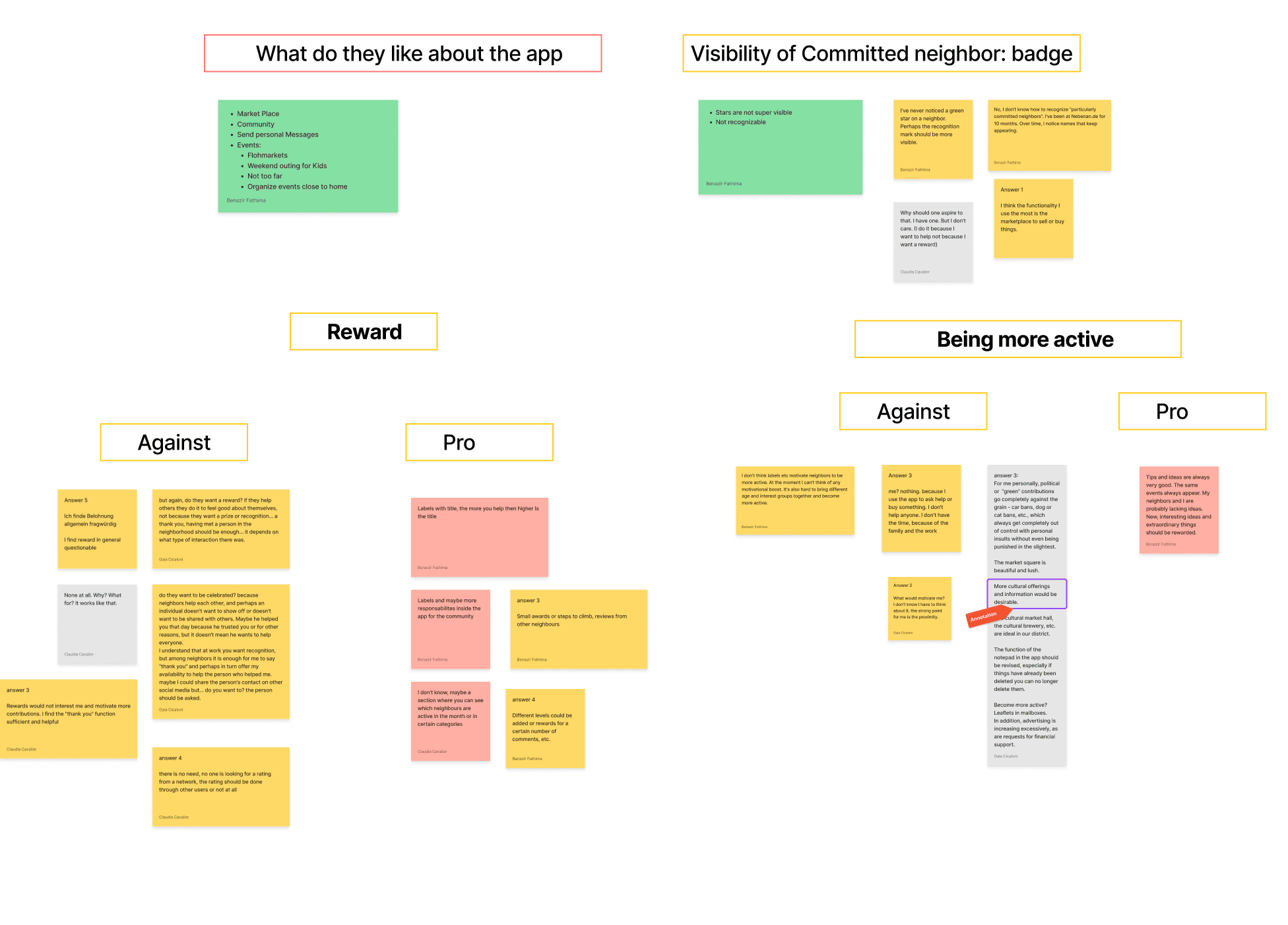
After the interview, all our notes were transferred to post it in Figjam in order to create an Affinity Diagram. We realized we might have interpreted the process in different ways, so we decided to proceed with solo approach first, each clustering post-its in their own way. After that, we catogorized as visibility of committed neighbor, Being more active, rewards and what do they like about the app.
Affinity Diagram
User Persona
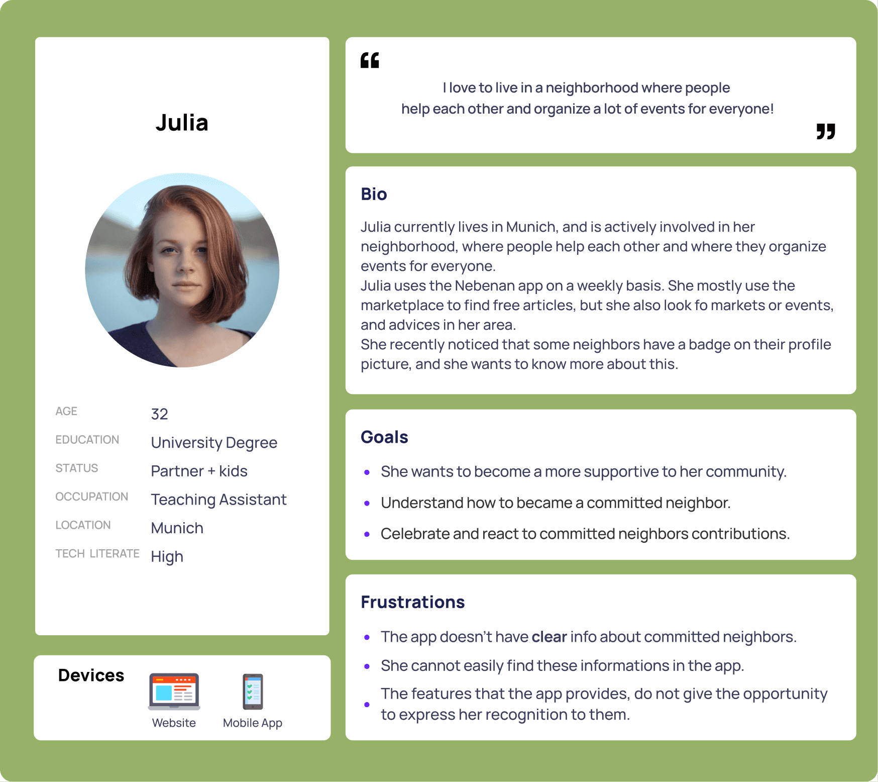
We created the user persona Julia, She using the app. She wants to engage with her neighbors. Goal and frustration then we decides to make a plan for the app.
Problem Statement
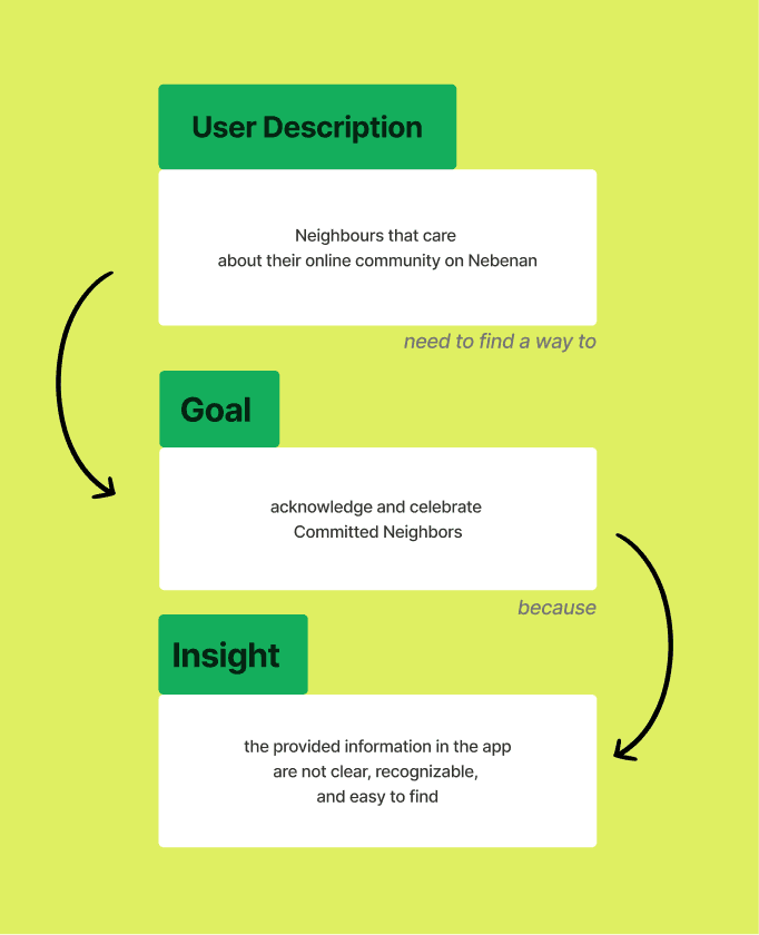
We dig deeper into the problem statement that Our User Persona wants to engage with neighbor. but the provided information is not clear.
Moscow Method
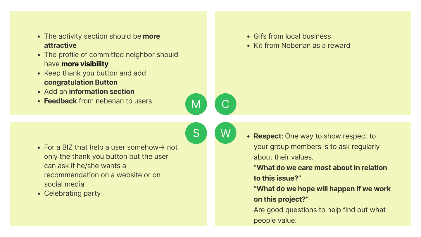
Then we moved on to ideation. We started with the ‘Crazy 8’ and ended up with lots of ideas. Some were professional and others impractical.Some of which turned into our feature ideas. Ideation is of two types.
We chose the MOSCOW method. We derived the issues and split them into different impact effects.
Ideate
Information Architecture:Sitemap
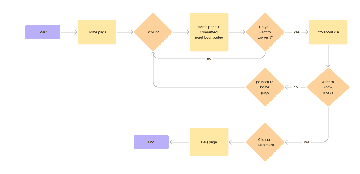
User flow includes all processes from opening the app until closing it. We drew our userflows individually and combined it together to make a perfect home page feed to highlight the committed neighbor and FAQ page to show the details.
Moodboards & Components
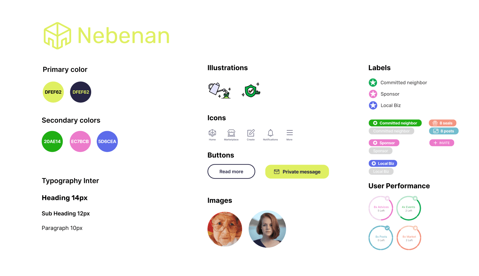
Our Stakeholder gave us new colors and designs for the app. We used the colors and added extra features for the icons and Ilustrations.
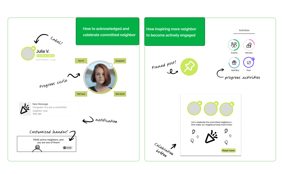
Ideas
Hi-fidelity Prototype
Finally we come to the hi-fi From the Low-fi and mid-fi sketches.
Conclusion
The process and the final result has left me very satisfied. It has been hard work, especially when it comes to taking out the Problem Statement. But I think that the proposed option is the best to solve the frustrations and needs of my user.
As a key learnings, I have learned a lot through the tests. Posing the questionnaire screen a thousand times, learning by listening to the users and making the most correct decision has been the most rewarding part of the project.